Customize-Tab-Customize-User-Interface-Editor

Customize Tab (Customize User Interface Editor)

Customize Tab (Customize User Interface Editor)

NOTE:Some settings and options shown in the example are not available in AutoCAD LT.

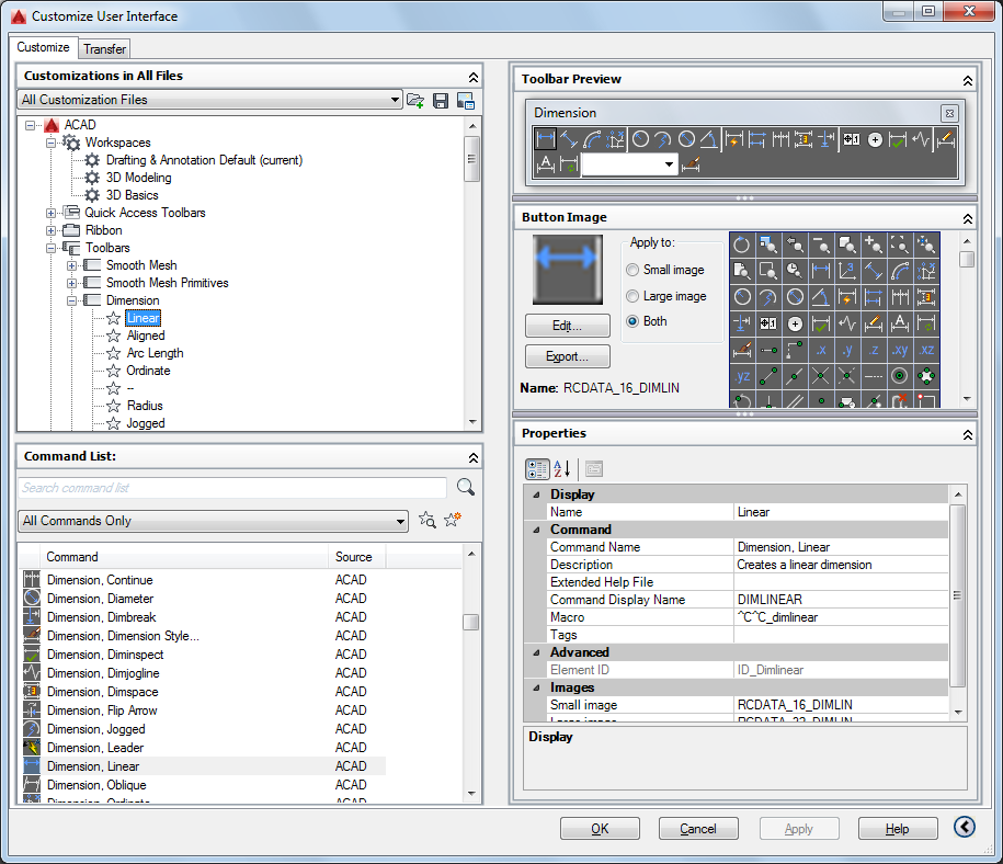
Provides an interface for customizing workspaces, toolbars, menus, ribbon panels,
shortcut menus, and other user interface elements.

NOTE: When the Customize User Interface Editor is displayed using the Customize Commands
option from the Tool Palettes window or the Customize option from the Quick Access
toolbar or a toolbar, the Customizations In pane is collapsed and the Command List
pane is expanded.

List of Options

The following options are displayed.

Customizations In Pane

Displays a tree structure of user interface elements that can be customized, such
as workspaces, toolbars, menus, ribbon panels, partial CUIx files, and so on.

List box

Displays a list of CUIx files that are loaded and an Open option.

Available Customizations In toolbar

Contains Load Partial Customization File and Save All Current Customization Files
buttons.

Load Partial Customization File

Loads a CUIx file that you can add to the acad.cuix file (for AutoCAD) or acadlt.cuix file (for AutoCAD LT).

Save All Current Customization Files

Saves changes to all loaded CUIx files.

Image Manager

Displays the Image Manager, in which you can import, export, and delete images stored
in a loaded CUIx file.

Tree View

Displays the current customization file in a structured view so you can add and modify
the user interface elements.

Dynamic Display Pane

Displays content specific to the user interface element you select in the tree view
in the left pane.

Information

Describes selected user interface elements that do not have properties (such as the
Toolbars node, Menus node, and Shortcut Menus node).

Properties

Displays the properties of user interface elements or items selected in the tree view.
Elements or items that display properties include specific menus, menu commands, toolbars,
and toolbar buttons.

Button Image

Displays the images that can be assigned to a command. You can create new and edit
existing images with the Button Editor.

Shortcuts

Displays a list of shortcut key names and temporary override names, their corresponding
shortcut key combinations, keyboard shortcut type (shortcut key or temporary override),
and the source CUIx file name.

Toolbar Preview

Displays a preview of the selected toolbar.

Panel Preview

Displays a preview of the selected ribbon panel.

Quick Properties

Displays a list of object types and associated properties. You can specify which object
types and properties are enabled to use with the Quick Properties panel and rollover
tooltips.

Command List Pane

Displays a list of commands that are loaded in the program.

Categories

Displays filters for the command list, including All Commands, <Product Commands,
User Defined, Toolbar Control Elements, or Ribbon Control Elements. You can also filter
the list to display commands within a specific CUIx file.

Find Command or Text

Searches the current CUIx for a selected command or matching text string. Displays
the Find and Replace dialog box.

Create a New Command

Creates a new command. You can add or change properties and create or edit a button.

Properties Pane

Displays user interface properties that you can view, edit, or delete.

General

Displays the name and description of a command or user interface element.

  • Name – Displays the name of the user interface element. The name you enter is the label
    or tooltip name displayed in the program.
  • Description – Displays the description for the user interface element. The description you enter
    is displayed in the status bar or in a tooltip.

Properties for Ribbon Tabs and Panels:

  • Display Text – Displays the name of the ribbon tab or panel.

Properties for Ribbon Tabs:

  • Contextual Display Type – Specifies whether the ribbon tab replaces all ribbon tabs on the ribbon or is merged
    with the ribbon tabs already displayed on the ribbon. (Full or Merged)
Display

Determines which user interface elements are displayed after start up or when a workspace
is set current.

  • Start On – Specifies if the Model tab or last used layout is set current. (Model, Layout,
    or Do Not Change)
  • Menu Bar – Specifies the display of the menu bar. (Off or On)
  • Status Bar – Specifies the display of the status bars. (Off, On)
  • Model/Layout Tabs – Specifies the display of the Model and layout tabs along the bottom of the drawing
    window. (Off, On, or Do Not Change)
  • Scroll Bars – Specifies the display of the scroll bars in the drawing window. (Off, On, or Do
    Not Change)
Partial File Behavior

Controls how ribbon tabs are displayed when in a CUIx file that is being loaded as
a partial customization file.

  • Default Display – Specifies whether the ribbon tab is displayed on the ribbon when in a CUIx file
    that is loaded as a partial customization file. (Do Not Add to Workspaces or Add to
    Workspaces)
  • Workspace Behavior – Specifies how the ribbon tab is merged or added to the ribbon when this CUIx file
    is loaded as a partial customization file. (Add Tab Only, Merge Tab Only, or Merge
    or Add Tab)
Appearance

Controls the appearance of toolbars, ribbon panels, commands on a ribbon panel, and
ribbon tabs.

Properties for Ribbon Panels:

  • Resize Style – Specifies the resize style for a ribbon panel when the ribbon is reduced in size.
    (Collapse as Needed, Never Collapse, or Collapse Last)

Properties for Ribbon Panels on Fold Panels and Sub-Panel:

  • Top Justify – Specifies the vertical justification for contents within sub-panels, or for fold
    panels of different heights.
  • Resize – Specifies whether the panel can be resized.
  • Resize Priority – Specifies the resizing priority of panels. When the ribbon is compressed, panels
    with lower values resize first. When a ribbon is expanded, panels with higher values
    resize first.

Properties for a Command on Ribbon Panels:

  • Button Style – Specifies the orientation, size, and label display of the command. (Large With
    Text (Vertical), Large With Text (Horizontal), SmallWithText, SmallWithoutText, or
    LargeWithoutText)
  • Group Name – Specifies the group name for the command when grouping is enabled for a drop-down.

Properties for Drop-downs on Quick Access Toolbars and Ribbon Panels:

  • Behavior – Specifies if the button executes a command or displays a list of commands. (Drop
    Down Menu with Recent, Drop Down Menu, Split with Recent, Split, or Split with Recent
    (Static))
  • SplitButtonListStyle – Specifies how the commands on the drop-down will be displayed. (Icon, IconText,
    or Descriptive)
  • Button Style – Specifies the orientation, size, and label display of the button for the drop-down.
    (Large With Text (Vertical), Large With Text (Horizontal), SmallWithText, SmallWithoutText,
    or LargeWithoutText)
  • Grouping – Specifies whether commands under a drop-down are grouped together using their assigned
    group names. (Yes or No)

Properties for Toolbars:

  • Default Display – Specifies whether the toolbar is displayed when in a CUIx file that is loaded as
    a partial customization file. (Do Not Add to Workspaces or Add to Workspaces)
  • Orientation – Specifies the location of the toolbar. (Floating, Top, Bottom, Left, or Right)
  • Default X Location – Specifies the X location of the toolbar when floating.
  • Default Y Location – Specifies the Y location of the toolbar when floating.
  • Rows – Specifies the number of rows the items on the toolbar are displayed in when the
    toolbar is floating.

Properties for a Separator on Ribbon Panels:

  • Separator Style – Specifies the style for the separator. (Line or Spacer)
Access

Controls the key combination assigned to a shortcut key.

  • Key(s) – Specifies the key combination assigned to a shortcut key.
  • KeyTip – Specifies the keytip character to access a command or control from the ribbon.

Properties for Drop-downs on Quick Access Toolbars Ribbon Panels:

  • ToolTip Title – Specifies the alternate title for the tooltip of a drop-down when its Behavior
    property is set to Drop Down Menu.
Resize Style

  • Hide Text – Specifies that the text is never removed.
  • Wrap – Specifies that the content does not wrap inside the panel.
  • Shrink – Specifies the width of Row Panel never decreases below the default size.

Properties for Ribbon Fold Panels:

  • Default Size – Specifies the size of the panel contents in a floating panel.
  • Minimum Size – Specifies the smallest size each control in the panel collapses.
  • Maximum Size – Specifies the largest size each control in the panel expands.
IMPORTANT:

Maximum Size must be greater than or equal to the Default Size, and Default Size must
be greater than or equal to Minimum Size.

Size

Controls the size of a tablet menu.

  • Rows – Specifies the number of rows for a tablet menu.
  • Columns – Specifies the number of columns for a tablet menu.
Slide

Specifies the slide library and slide to use for a command in an image menu.

  • Slide library – Specifies the slide library for the slide used for the command in an image menu.
  • Slide label – Specifies the slide to use for the command in an image menu.
Shortcut

Controls the key combination and macros assigned to a temporary override key.

  • Key(s) – Specifies the key combination for the temporary override.

    Click the [..] button to display the Shortcut Keys dialog box. Click in the Press
    New Shortcut Key text box and assign the desired key combination.

  • Macro 1 (Key Down) – Displays the macro to execute when the key combination is pressed.
  • Macro 2 (Key Up) – Displays the macro to execute when the key combination is released.
Command

Displays the properties assigned to a command.

  • Name – Displays the name of the command. The name you enter is the label or tooltip name
    displayed in the program.
  • Description – Displays the description for the command. The description you enter is displayed
    in the status bar or in a tooltip.
  • Extended Help File – Displays the file name and ID from the extended help file that should be displayed
    when the cursor continues to hover over a toolbar, panel button, or menu item for
    a specified period of time.

    Click the [..] button to display the Select Extended Help File dialog box. Select
    a XAML file that contains tooltip definitions and then select the tooltip content
    to display from the Select Help ID dialog box.

  • Command Display Name – Displays the command line text string that is shown in the command tooltip.
  • Macro – Displays the macro assigned to a selected command. You can create a macro or edit
    an existing macro.

    Click the [..] button to display the Long String Editor dialog box and the full contents
    of the macro.

  • Tags – Displays the user-defined keywords that are associated with a command. Tags can
    be used to search for commands in the menu browser.

    Click the [..] button to display the Tag Editor dialog box. Click the Tags text box
    to add, modify or remove tags. Each tag must be separated by a comma and the total
    number of characters for all the tags and separators cannot be more than 256 characters.

Advanced

Displays the aliases and element IDs that you can define for each user interface element.

  • Aliases – Specifies a unique value for a user interface element that is used to programmatically
    reference the user interface element.

    Click the [..] button to display the Aliases dialog box. Click in the text box and
    edit the list of assigned aliases.

  • Object Name – Specifies the object type associated with a double click action.
  • Element ID – Displays the tag that uniquely identifies a command or user interface element.
Images

Determines which images are assigned to a command when displayed on a user interface
element.

  • Small Image – Specifies the small image file to use when a command is added to a toolbar, menu,
    or ribbon panel.
  • Large Image – Specifies the large image file to use when a command is added to a toolbar or ribbon
    panel.

Quick Properties Pane

Displays a list of object types and the properties associated to the selected object
type.

Edit Object Type List

Controls which object types are used with the Quick Properties panel or rollover tooltips.
Displays the Edit Object Type List dialog box.

Object Type List

Displays a list of the object types you can use with Quick Properties panel or rollover
tooltips.

General

Displays the general properties that are available for all object types in the Properties
list.

Properties List

Displays the properties for the selected object type or the general properties available
for all object types.

Reset Overrides

Overrides the selected general properties for all object types.

Learning AutoCad

spick the [..] button to display the Long String Editor dialog box and the full contents of the macro. Tags – Displays the user-defined keywords that are associated with a command. Tags can be used to search for commands in the menu browser. Click the [..] button to display the Tag Editor dialog box.Customize Tab. Before you start customizing ribbon tabs and panels, Quick Access toolbars, and other user interface elements, familiarize yourself with the Customize User Interface (CUI) Editor, which can be opened with the CUI command.user interface elements to or from a main or partial customization (CUIx ) file, where your interface element data is stored. Note: Some settings and …Customize User Interface Editor by clicking the Manage tab of the ribbon, Customization panel, and then User Interface (see Figure 1). Once you have …Apr 13, 2015UI elements with Workspaces. Last, it shows how to use the Transfer tab of the CUI editor to import customization …Modify your org's user interface by enabling or disabling these settings. … It displays by default on the tab home pages for leads, accounts, contacts, forecasts , … When enabled with the Enable Inline Editing setting, users can also edit records …… This will bring up the Customize User Interface editor. Select on the Transfer tab and notice that you have two panels that say "Customization in …… So let's discuss about customize user interface (or CUI). … open the dialog by clicking the button in manage tab>customization>user interface.Custom UI part in the Custom UI Editor. The Ribbon code will be stored here. In Excel, close …

نظرات کاربران


درباره نویسنده


بنده سیامک دوستداری فارغ التحصیل رشته مکانیک سنگ از دانشگاه صنعتی اصفهان هستم، و در این وبسایت آموزش های مربوط به نحوه برنامه نویسی در اتوکد و هچنین آموزش تصویری دستورات اتوکد را قرار خواهم داد.

تلفن همراه: ۰۹۰۰۱۲۳۴۴۴۴

ایمیل: s.doostdari@gmail.com

ترفند های اتوکد


دسته بندی مطالب​